Welcome to the Stress Test Playground template.
Here you can play with different drag-and-drop sections, modules and also copy style references (CSS classes)
Typography Modifiers.
These are the typography modifiers CSS classes that can be added to any text body, such as rich text modules, blog and other individual modules.
XXXL - 96px
.text-size--xxxl
XXL - 72px
.text-size--xxl
XL - 42px
.text-size--xl
Large - 32px
.text-size--large
Medium - 20px
.text-size--medium
Regular - 16px
.text-size--regular
Small - 14px
.text-size--small
Bold
.text--bold
Regular
.text--regular
Light
.text--light
Buttons and CTAs.
These are the CTA types and modifiers that are intended to be used based on the relevance and content. These can be added to links, buttons, divs and more.
Additional Modifiers.
These are the additional modifiers that are intended to be used in specific cases. These can be added to body copy, images and backgrounds (depending on the use).
Italic
.text-mod--italic
Marker
.text-mod--marker
Highlight
.text-mod--highlight

Classes Usage.
You can add these classes by editing the source code of any rich text/content field in a module by clicking in "Advanced" then "Source Code"
Light Heading 3 Sample
<h3 class="text--light">Light Heading 3 Sample</h3> Bold Large Heading 4 Sample
<h4 class="text-size--large text--bold">Bold Large Heading 4 Sample</h4> XL Heading 3 Sample with Highlight
<h3 class="text--xl">XL Heading 3 Sample with <span class="text-mod--highlight">Highlight</span></h3> This text here is MARKED
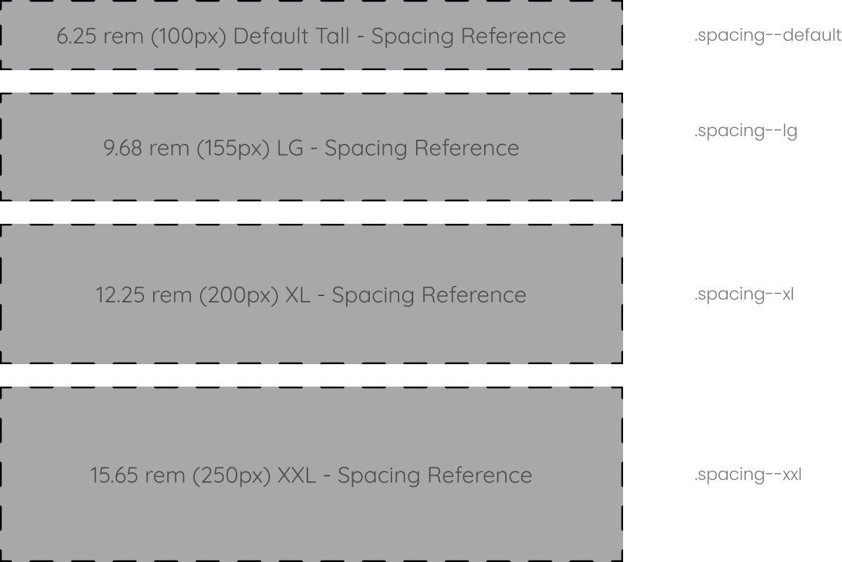
<p>This text here is <span class="text-mod--marker">MARKED</span></p>Spacing References.
These are the key spacing blocks used across the theme inside modules and between sections.

Form Stress Test.
This is just a form with a couple fields to test and stress test how it will behave inside the theme.